Guide & How to's How to Create and Present a SaaS Board Presentation Most board meetings follow the same pattern. The founder shares the screen, walks through forty slides, and the board sits quietly until the Q&A. An hour passes. Nothing get... June 9, 2026 7 min read
Reviews Canva vs PowerPoint in 2026: Which Tool is Right for You? PowerPoint text boxes have been a headache for decades. Canva changed the game when it arrived. But did it replace PowerPoint entirely? Both are among the best presentation tool... May 21, 2026 May 15, 2026 7 min read
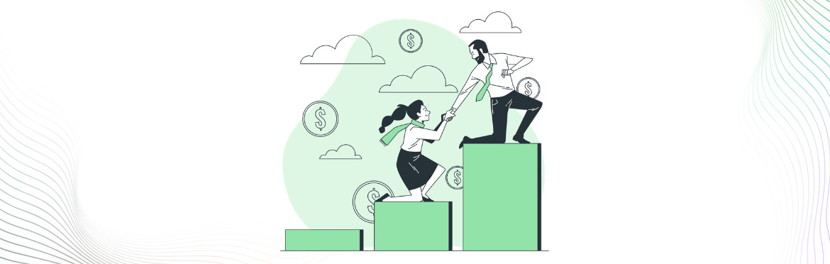
Guide & How to's How to Build a B2B SaaS Go-To-Market Strategy That Actually Scales Roughly 70% of SaaS startups fail because no one figured out how to sell the product. That’s a painful statistic if you’re sitting on a product you believe in. Good ... May 15, 2026 13 min read
Guide & How to's OKR Framework: How to Set Goals That Drive Real Business Results Every company sets goals. That part isn’t hard. What’s hard is setting them in a way that people actually remember two months later, and that actually shapes what ge... April 28, 2026 11 min read
Guide & How to's How to Superscript in PowerPoint (Step-by-Step Guide) If you have ever typed E=mc² or tried to add a trademark symbol in a slide and ended up with regular-sized text sitting awkwardly in the wrong place, you already know why super... April 26, 2026 9 min read
Guide & How to's How to rotate an image in Google Slides in seconds (with examples) Images sit perfectly straight in your slides. Everything looks tidy and organized, but the design may lack visual interest. In such cases, you can tilt an image slightly to add ... March 10, 2026 7 min read
Guide & How to's Last slide of a presentation: 10 powerful ways to end strong (examples inside) You’ve spent hours on your presentation. The data checks out, stories land perfectly, visuals look sharp. Then you reach your last slide, and everything deflates. Generic ... February 25, 2026 9 min read
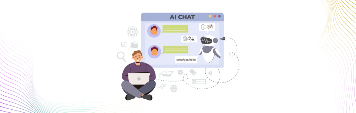
Guide & How to's Make a PowerPoint using ChatGPT in minutes Building presentations takes forever. Time flies when you’re deep in research, connecting the dots, and writing your slides. Ever wish someone else could take care of all ... February 2, 2026 11 min read
Reviews Tome vs Beautiful AI: Why you might want to skip both Search “AI presentation maker,” and you’ll see Tome and Beautiful AI at the top of every list. Both promise to reinvent the way we create slides. Both talk about “saving... June 5, 2026 February 2, 2026 8 min read
Guide & How to's How to print Google Slides with notes: step-by-step You’ve built a great presentation in Google Slides. Now you need to print it with your speaker notes attached. Maybe you’re rehearsing a pitch or just prefer having ... December 24, 2025 6 min read