
In the modern digital era, it takes a lot of effort to stand out from the competition. When looking to win over potential investors, you first have to understand their needs and then present your company’s story in the most effective way.
So, the question is: how to design a pitch deck that actually attracts investors?
Let’s jump in and find out now! In this article, we’ll share valuable strategies and tips on how to write a pitch deck that will help grab the investors’ attention from the get-go. Follow them, and you’ll not only avoid being boring but also produce effective pitch decks that are carefully designed to communicate your message effectively.
Table of Contents
What’s a pitch deck?
A pitch deck is a set of visually appealing slides (usually designed in PowerPoint) that you create to give venture capitalists or angel investors a brief summary of your company or business plan and its potential for growth. Consider it a medium through which the value of your business idea, fundraising needs, and financial goals are communicated to the target audience.
Even though it’s only the initial step in the process, a pitch deck is essential in helping a company raise funds.
With that, let’s move on to the components of a powerful pitch deck.
How long should a pitch deck be?
Good pitch decks often have 10 or more slides. However, depending on the number of slides you require, you can either go beyond or below this number.
What to include in a pitch deck
The secret to a successful pitch deck is ensuring you cover all the essentials, include all the slides your investors expect to see, and keep your presentation short.
The reason is simple: A brief yet concise deck is always a winner.
Here’s a quick outline of the key components of a pitch deck.
1. Title
In your pitch deck, the title is the first slide to appear. It’s more of an impression-making slide that introduces your business or idea.
Pay close attention to the visual components (color scheme, fonts, and any images) as they help establish the tone.
Additionally, it’s better to keep text to a minimum. The names of your company and you are sufficient. If you have one, you can also add a tagline.
Here’s a great example:

2. Introduction
Here you introduce yourself and establish credibility. You can also use this slide to explain your value proposition or tell about your business.
Pro tip: Since you want to draw attention to the business and not yourself, the shorter the introduction, the better.
Here’s a great example:

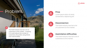
3. Problem
The problem slide is where you actually start telling your story.
Use as many visual signals as you need to communicate your problem effectively. If you fail in this step, you won’t be able to persuade your audience of the need for your business idea or product.
Pro tip: You can skip the introduction and jump right into the problem. Use whatever works to capture investors’ attention and advance your case; there are no rules.
Here’s a great example:
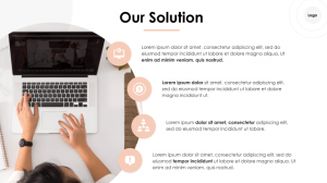
4. Solution
After stating the problem, it’s time to provide a workable solution, such as your service or product.
You can introduce the solution by sharing your MVP or listing the product’s features.
Pro tip: It’s better to focus on each feature’s advantages rather than the feature itself and keep them up to 3-4 at most.
Here’s a great example:
Alternatively, you can display the problem and solution on a single slide, making it easier for your audience to establish connections and understand how your solution fits into the overall picture.
5. Size, trends & opportunities of the market
This slide is where you use numbers to show the market size or use data visualization to make a point.
Pro tip: To make data easier to understand, use pie graphs, bar charts, surveys, and other visuals rather than simply listing numbers.
You can spread information over several slides, following the example:

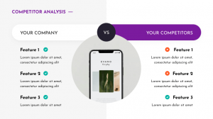
6. Comparison
In case your product has competitors, we recommend adding a comparison slide to demonstrate how your product differs from the competition. By doing so, you may successfully position your product while maintaining the interest of your audience.
Here’s a great example:
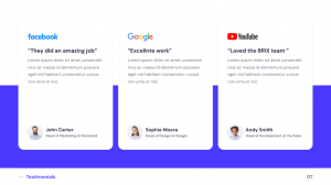
7. Reviews
Customer reviews add social proof, which is a wonderful way to wow your audience, foster more trust, and emphasize the demand for your service or product.
If you don’t have any reviews yet, you can utilize this slide to showcase negative reviews of the competitors.
Pro tip: Ensure the reviews refer to the problem your product will solve.
Here’s a great example:
8. Our team
If your business employs more than one person, you will need a slide introducing your team members.
This slide can also highlight the great minds serving as advisors to your project and potential investors or others you are trying to persuade to join you.
Pro tip: Give preference to real human faces, not stock photos.
Here’s a great example:

9. Traction
Use this slide to show your accomplishments to investors. A line graph can help you visually display your user base growth if you already have one.
Still waiting for traction? Not a problem. Pay as much attention as possible to promote your business idea and its capabilities.
Here’s a great example:

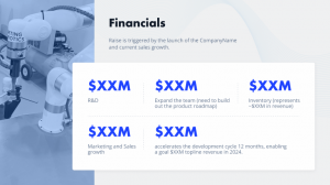
10. Financials
This slide is where you present all financial forecasts for your business idea. Make sure to include information on how you’ll charge people and how your plan will help you reach your financial goals.
Pro tip: To make the information more digestible, you can show it as a table or use data visualization.
Here’s a great example:
11. Marketing and sales strategy
Your marketing and sales strategy will come in handy at this point since interested investors will definitely want to know how you intend to accomplish your goals and the financial forecasts you’ve outlined.
Pro tip: Use a flowchart, timeline, or other visual aids to illustrate your strategy. You can also highlight key strategies using bullets and icons.
Here’s a great example:

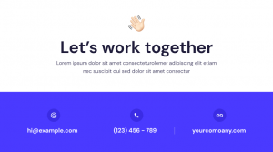
12. Call-to-action
This slide is the one that makes the ask.
You don’t require anything special here. Your audience will be eager to contact you, spend money, or do whatever else you want them to if you tell an engaging story.
Pro tip: Make sure to include your contact information in this slide.
Here’s a great example:
Now that you know what to include in a pitch deck, let’s move on to best practices and design tips.
Pitch deck best practices
Startups and businesses frequently create their pitch decks with themselves rather than their audiences in mind, which actually does no good. That’s why we’ve added some of the most important lessons learned to the list below for you to use while creating the perfect pitch deck for your service or product.
1. Consider your target audience
Designing your pitch deck with your audience in mind is essential, whether you’re presenting to an angel investor or a venture capital firm. Consider what they could be looking for and learn more about the other businesses they support.
2. Concentrate on your message
Just say what you need to say. The time is not right for long stories.
3. Provide accurate information to your audience
Too frequently, we feel the need to share every last nuance of what we know. A wall of text, however, might seem overwhelming for a prospective investor. Knowing what to include and where will help you build a strong foundation for your deck.
4. Make your data tell the story
The most crucial elements of any pitch deck are, without a doubt, the numbers. Use storytelling and visuals to evoke emotions and display your product in action.
5. Get straight to the point
When creating an investor pitch deck, there are a few fundamental rules that you should follow:
- Keep your deck short.
- Be honest in everything you say or write.
- Keep your slides simple and visually appealing.
6. Ensure your deck looks good
Your pitch deck’s success is greatly influenced by the design of pitch deck elements. We will discuss design-related tips in the next section, so read on.
Pitch presentation tips
Making information simple to read should be the goal of your pitch deck design. To follow best practices and develop a powerful pitch deck, you need to:
- Simplify difficult concepts.
- Concentrate on important details.
- Where appropriate, include supporting documentation.
1. Convey your message clearly
A simple layout and color scheme will make your message stand out while still being on the safe side. Even your color scheme alone might work in your favor if you incorporate color psychology into your design.
2. Always visualize data
It is impossible to overstate the significance of data visualization. Investors can comprehend complex data easily if you use charts and diagrams.
3. Leverage emotion
Your pitch deck has to communicate more than just plain facts. It can truly stand out by triggering some form of emotional response. Use it to your advantage!
4. Choose legit fonts
People attempt to make presentations “fancy” far too frequently while overlooking the need for people to be able to see the text on the page clearly. Make sure your font size and typography are both easy to read and contrast well with each other.
Give preference to Verdana, Georgia, Montserrat, etc., and stick with 3 fonts at most.
5. Make sure your pitch deck matches your branding
An effective strategy for maximizing the power of visuals is to maintain a consistent brand image. This not only shows off your professionalism but also assists in tying your brand to the product or service you’re offering.
6. Don’t clutter slides
Use only the visuals you absolutely must have on your slides; leave out any extra icons or graphics.
Ensure every component of your design contributes to the overall vision.
7. Consider your audience’s preferences
Make sure to adapt any pitch deck templates to your audience’s tastes, starting with the one that best suits them.
8. Be consistent
Consistency is critical when using design elements like header, footer, and style icons. This could mean the difference between potential investors considering you an investment-worthy candidate or needing to be more detail-oriented to notice inconsistencies.
9. Contrast is essential
Design with contrast in mind, whether it’s in your icons, font, or other design elements.

10. Showcase your all-star team
To help investors understand who they are investing in, use professional headshots of your team members and make sure to emphasize each member’s significance.
Having a hard time designing or need more specific advice on how to write the perfect pitch deck? Don’t hesitate to hire the SlidePeak team to do the work for you. We’d love to help you take your pitch deck to the next level!