
Presentation design is actually a combination of certain elements, which are text optimization, font selection, color and background selection, icon selection, and figures. If you want to have a perfect, totally polished presentation, you should pay close attention to each element. Here are five steps that will help you move rationally.
Table of Contents
1. Optimize text
When crafting a presentation, try to present the summarized information, without complicated wording and formulas. If you speak in public, reduce the text in your presentation to the minimum (remember that you can tell your audience all the necessary information). These simple rules will improve the perception of your PowerPoint slides design.
Hierarchy of text
Create a hierarchy in the text using font size, color, or boldness. Decorative fonts work well for headings, but you’d better not to use them for body text. Also, you can prioritize using information layers (no more than 2-3).
In terms of meaning, try to build your presentation on the following hierarchy: the main idea, the main content of the slide, details, explanations, clarifications, readability, and font size. Try not to center large paragraphs of text; use left justification.
Tips: I recommend using from 24 to 28 points in presentations for public speaking, and from 12 to 14 points in presentations for sending and reading.

Spell Checking
Check the text, so that it does not turn out nonsense. Some mistakes can be fateful, as they are offensive to your audience. People notice these flaws, and they can even point it out loudly, shouting from the crowd.
Tips: I often found myself in a situation when I made a presentation with an error on the slide. It’s not the end of the world anyway, so don’t get too upset if it happened to you.
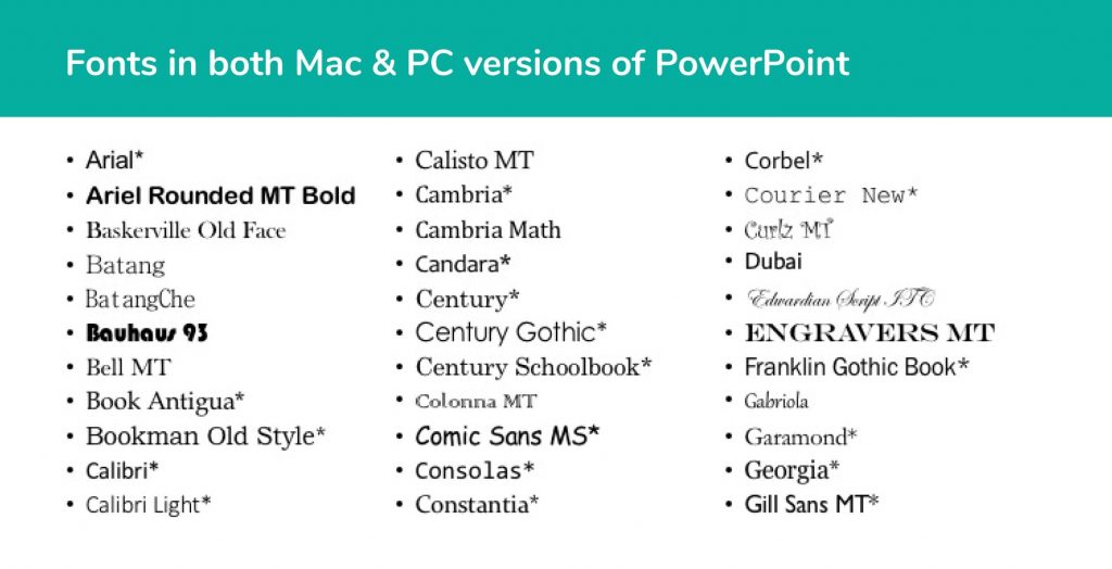
2. Select font
The basic rule for fonts in a presentation is the following:
Make it large and readable.
A font is actually a tone of voice that you are talking to your audience. It can scream, speak calmly, be playful, or strict. You can use the decorative font for the heading, but the rest of your text must be clear. There should be a visible difference between the header and the main font, although comments and notes can be simply in smaller type.
Tips: I recommend using no more than 2 or 3 fonts in one presentation.
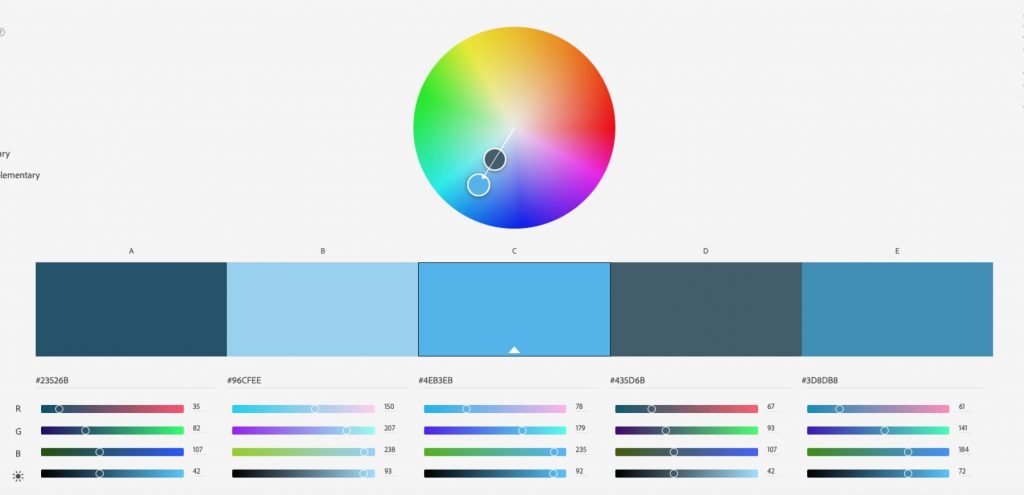
3. Select color palette
Color is an essential visual component of the presentation. Color can change the attitude of the audience — from aggression and focus to relaxation and friendliness. When choosing a color, you need to build on the corporate style or theme of your presentation.
First, decide on the primary color, then select the color palette (or simply apply one). If you are performing in a dark room, try to use dark backgrounds, if in a light room, then light backgrounds are preferable. Focus color should not be used everywhere — it should stand out.
Tips: Integrate PowerPoint colors using the Eyedropper tool. The way the tool works is very simple — it copies the color and applies it to the selected object or figure.
4. Select icons
In three days, people remember only 10% of the information they heard. But if you illustrate the data with a picture or an icon, then the percentage will increase to 65%. Do not forget about this effect while crafting your slides.
Tips: There are many sites with icons, so you don’t need to be a designer to get them. The main thing is that you must use icons of the same style, in one color palette, complementing the text within the meaning.

5. Use figures
The first question that you may have is where to get these figures. Well, PowerPoint has plenty of them, and they are easy to find. Let’s see how they can complement and shape the presentation design. Some figures can help you assemble objects on a slide into semantic blocks. For example, you may use the line to separate the subtitled heading from the main text part. Focus can be created not only with color or size but also with graphic elements. Those elements can control the attention on your slide.
Tips: The lines do not have to be solid; you can set the stroke length, put arrows at the ends, choose other settings.

There are three main criteria for a successful presentation: what you tell, how you do it, and what you show. Poor design will not make your presentation a failure if you are a skillful storyteller. But a beautiful and functional presentation design will definitely enhance understanding of the material.