![50 tips on how to improve PowerPoint presentations in 2022-2023 [Updated]](https://slidepeak.com/wp-content/uploads/2021/09/2-1170x372.png)
While PowerPoint helps create a compelling presentation, a business meeting or a lecture can easily turn boring if the information is less engaging or distracting. This post acts as a guideline on how best to improve PowerPoint presentation and make your message remembered by any audience, whether business owners, students or even homemakers. Plus, you will also learn the easiest ways to make a better PowerPoints presentation without it taking forever and convey the content in the best possible way by presenting it with maximum impact. So let’s get down to it!
Create a memorable opening slide
Your presentation’s opening slide resembles a book cover. You choose whether to open and read the book based on what you see. The same often holds true for PowerPoint slides. To make better PowerPoint slides that immediately catch the audience’s attention, you should always make sure the opening slide contains an intriguing headline and a noticeable image.
These tips will help you create a perfect opening slide:
- Come up with a catchy headline.
- Keep your ppt slides tidy.
- Impress with sophisticated colors and images.
Remember, for your PowerPoint slides makeover to get the desired results, your slides have to be designed following the best practices.

Keep your presentation simple
Do you often find yourself typing, “how to improve my presentation,” but can’t seem to get a definitive answer? The answer could be a PowerPoint slide makeover. Too much text on a PowerPoint makes the presentation forgettable, hard to pay attention to, confusing, and overwhelming.
To improve PowerPoint presentation:
- Ensure that your slides don’t have too many words.
- Go for a PowerPoint redesign where a striking image is teamed with a simple but clear message.
- Use the 1-6-6 ppt presentation redesign rule to include not more than six bullet points and six words per slide.
Pros usually improve PowerPoint presentation by limiting the words on the slides to allow the audience to listen to you and not focus more on reading. So instead of using complete sentences in your ppt redesign, use short forms that improve your memory. That way, a presenter can focus on each specific point and make it easier for the audience to comprehend which point in the ppt slides is being covered.
Present one idea per slide
If you want to craft a powerful PowerPoint like a pro, the first tip is to have only one idea per slide. But why is it necessary to have one main point per slide?
The first reason is to improve PowerPoint presentation. Your slides should not read like a textbook or novel. Otherwise, you might redo the whole thing or get a PowerPoint slide makeover. So let’s uncover more reasons why you should have only one idea per slide.
- The audience will focus on a single idea that prevents them from getting confused or overwhelmed by the slides.
- It allows the presenter to give more details orally, which motivates students to attend class.
- It prevents giving out too much information that dilutes the central message in the slides.
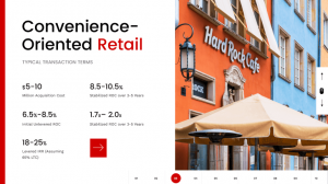
If you are worried about the low word count in your slides, go for a PowerPoint redesign and add impactful imagery or visual aids. Ensure each point is consistently structured and there is a clear transition in all slides.
Relevance and quality of content are key
There is plenty to consider when making a PowerPoint slide makeover. However, the relevance and quality of the content are among the top factors. The text has to be supported by relevant and quality images to ensure the presentation exudes professionalism.
In addition, PP slides created specifically for students must be aimed at improving learning. Some quick tips to ensure your slides are relevant and of decent quality are:
- Before presenting the content, ensure it engages the audience.
- Maintain quality by ensuring a slide is not full of text.
- Use structure to keep the content organized.
- If it does not fit in a single line, chances are high it is not relevant.
Ensure your slides don’t have too much information, as it reduces relevance. Since the human brain process images faster than text, convert any long paragraphs into appropriate visual formats.
Eliminate unnecessary text
The first step to improve PowerPoint is removing unnecessary text that might reduce the white space and make the slide look uncluttered. If the text is too much, your audience will focus more on reading the slides than what you want to say.
Don’t know how to make your slides simple? Use these tips:
- Remove any content that is not intended for your audience.
- Any phrases that are not clear should be eliminated.
- Be brief and clear.
- Only add two to three sentences on each slide.
- Replace words with visual elements.
No need to cram everything into a single slide redesign. Instead, include main phrases that help you remember what you want to talk about and ensure the listeners absorb the information you are conveying.

Always use one story per slide
The correct way to improve PowerPoint presentation is to use one story per slide. That way, your ppt slides won’t overwhelm your audience with too much information. Moreover, if you improve a ppt redesign, it will also prevent the presenter from diverting away from the main topic. Besides, people don’t attend lectures to read the ppt slides. But rather to hear you speak because you are an expert in that subject matter.
When you include only one story in a ppt redesign, it gives the audience a chance to:
- Concentrate on what you are saying.
- Quickly digest the information.
- Use the texts on the ppt slides to support your verbal presentation.
The story is what helps you focus on the central message and drive the point home. But even if you put a single story in each slide, ensure there is a great transition to avoid confusing the listeners. Also, make sure the story is consistently structured and doesn’t generalize the subject under discussion.
Use white space to make texts more readable
Using white space to your advantage is another way to improve PowerPoint presentation. How? With a good redesign, you will improve the readability of the text and add a professional effect to your slides. Without white space in a redesign, the information on your slides becomes disorganized, hard to read, and showcases clutter.
We all know that cluttered PowerPoint presentation slides are unattractive. But how do you know you need white space in your PowerPoint presentation slides? If you try to add white space but run out of space, your slides could probably benefit from less content and a redesign.
To improve PowerPoint presentation and make your redesign effective, consider active and passive white space and micro and macro white space. Overall, the type of white space to use to improve your redesign is determined by:
- Content
- User research
- The message being conveyed
- User interface design

White space is also crucial in directing the audience to focal points and helps improve specific text parts. So play around with the number of white spaces to improve your ppt redesign and shine the spotlight on specific points. If you are still wondering, “how do I redesign my presentation?” try improving the white or negative space.
Rework text-heavy PPT screens
Most people, especially in formal presentations, focus on making text-heavy slides. This often bores the audience and results in a disastrous presentation. Such a case leads a presenter to wonder, “how do I improve my presentation.” Ensure your slides are not loaded with text, as it reduces the chances of the audience paying attention to what you have to say.
Instead, the audience will be busy reading the heavy text screens, which reduces learning or understanding of the information. If you have heavy text slides and urgently need to enhance PowerPoint presentation, here are three tips to help you change them into impressive slides:
- Change data into graphs, charts, diagrams, or appropriate visual elements.
- Use infographics to showcase step-by-step procedures.
- Use different shapes to show the relationship between subjects or items.
- Convert long texts into bullets.
Finally, remove all text irrelevant to the central message and include only short phrases.
Visualize data
Do you have a lot of data in text format and want to change it to improve your slides? Visualize that data to enhance PowerPoint presentation. For complex data that can be compared, consider changing it into a graph format. This helps to reduce heavy text usage and makes the information easier to comprehend.
Wondering, “how do I improve my presentation through data visualization?” Use these tips:
- Go for visual elements that tell a story.
- Tweak the elements to make them easier to comprehend.
- Always opt for visual consistency.
- The headers for graphs and charts should be simple.
- Use one color to represent one type of data.

Data visualization is a great option for those who want to improve PowerPoint presentation. It makes it easier to convey a lot of information and still uses limited space. It also allows the audience to comprehend complex data.
Use original PowerPoint presentation templates
Looking at the same old PowerPoint template slides can make a fascinating topic boring. That’s why if you wish to make better PowerPoint slides, you must use original templates from trustworthy sites. For example, Microsoft PowerPoint has original template slides that you can use to create a great visual experience for the audience.
But why do you need original ppt template slides?
- To access a wide range of ppt redesign choices.
- To make it easy to create professional and visually appealing ppt presentations.
And the best part is that you don’t have to be an IT pro to use the ppt template slides.
Overall, original ppt template slides improve the redesign and give you confidence in the work you are presenting. They also eliminate the time-wasting factor of looking for and arranging the ppt redesign slides from scratch. When you redesign a PowerPoint template, the slides are already prepared and laid out for you. Adding fancy fonts, graphics, and relevant photos helps to improve your PowerPoint slides makeover even more.
These template examples can provide some inspiration:

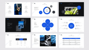

Remember, even after you improve the slides and have a ppt template at your disposal, you can still create custom slides. So take advantage of all the great features such as themes, shapes, and editing tools to improve a ppt redesign and give it a professional look.
Don’t let PowerPoint decide how you use it
If you allow the default settings of PowerPoint to dictate how you will create and present your slides, you are more likely to come up with a less creative piece. Instead, opt to improve your PowerPoint presentation with a ppt redesign.
Consider PowerPoint as a blank canvas but keep the design simple. That way, you won’t get overwhelmed by what to do or, worse, end up with a confusing ppt slide. Listed below are important tips to use when creating PowerPoint slides.
- Make better PowerPoints when dealing with macro details or concepts.
- Balance the text and image appropriately to avoid losing the audience’s attention.
- Make the message in the ppt slide clear and clutter-free.
After PowerPoint slides makeover, ensure that the content or concept is easy to absorb. Remember, there is no one-size-fits-all approach, and PowerPoint slides are effective for a large audience of around 20 people.
Create a new PPT presentation for a template or blank page
When you start a project in PowerPoint, you have to create a new presentation. This can either be from a ppt template or blank slides. You can also opt to open a previously made or an existing presentation and edit it to improve PowerPoint. The great part about making professional ppt slides is that you can work with the same presentation without making several changes.
Using a predesigned ppt presentation or template is also advantageous and time-saving. This is because ppt templates have custom formatting options that allow you to save designs. This, in turn, reduces the need to start a new ppt project from scratch. With a ppt template acting as the foundation, each presentation will inherit:
- Colors
- Fonts
- Designs
- Layout
While ppt templates come with the material you can recycle for future presentations, they are often harder to modify. In such a case, it’s better to consider a PowerPoint redesign and start with a blank presentation.
Use slide master to edit your PPT slide template design
Knowing how to redesign a slide template is a great skill for anyone who wants to improve PowerPoint presentation. Editing a template allows the user to make the necessary changes that translate to an effective ppt presentation.
When you redesign your favorite ppt template or one that you really love, it creates custom designs that are clean and professional-looking. So how do you edit a PowerPoint template?
- First, pick a suitable ppt template.
- Add the number of ppt slides that fit the content elements you want to include.
- Adjust the ppt fonts and color.
- Remove the ppt slides you don’t need to make the redesign process easier.
The trick with good ppt slides redesign is to use the slide master placed under view and ensure the slides grouping fits what you want. Note that while the slide master is open, any changes you make to one ppt slide affect the entire pack.
Use duplicate slides to save time
Are you asking yourself, “how do I redesign my presentation without spending a lot of time doing it?” Use duplicate ppt slides! Using slides from a previous presentation eliminates the need to redesign the entire PowerPoint lecture.
The duplicate slide and copy-paste are some methods used to create duplicate ppt slides. The easiest method to duplicate ppt slides is to use the copy and paste method. For this ppt procedure to work, follow these steps:
- Start by right-clicking the ppt slide you want to duplicate.
- Select “copy” from the menu.
- Move it to a specific section on the ppt slide.
The duplicate technique involves opening the ppt slides show and selecting the sliding thumb from the slide you wish to duplicate. Then, when you right-click on any of the ppt slides, a menu will appear, allowing you to click on the duplicate slide option.
Select the right font
Font can make or break your PowerPoint presentation. When chosen right, it will improve PowerPoint presentation. Unfortunately, most presenters make the mistake of choosing a fancy font to add visual appeal to the content. That is a big mistake. When it comes to professional presentation, stick to a standard-looking font that doesn’t detract from the main message.
Some of the standard fonts that give slides a professional and clean look while making the text readable include:
- Arial
- Times New Roman
- Calibri
You don’t even need to download these fonts as they are accessible in all PowerPoint slides. So if you are still wondering, “which is the easiest way to redesign my presentation,” the answer is to use the appropriate font. Comic Sans and Mistral should be avoided, and using fonts like Forte sparingly is better. Serif and Helvetica are great for headers.
Make sure you use the proper font size
Your content font size greatly impacts how the audience perceives the information you are presenting. For example, it can affect navigation speed, the amount of content included in a single slide, and a reader’s experience. That’s why presenters who ask, “how do I improve my presentation?” are often advised to check the font size.
But which font size is appropriate for a PowerPoint presentation?
- Larger than 18 points improve readability.
- For titles, the font size is between 36 and 44.
- For text, maintain a range of between 24 and 36.
- Use a font size of 18-20 when adding explanatory text to a diagram or graph.
Overall, use a big enough fit to ensure anyone sitting at the back of the room can clearly see the slides’ contents.
Settle on specific style and color to use in a redesign
Thanks to its numerous features, PowerPoint has become the go-to option for making professional and impactful presentation redesign. That’s why when considering a PowerPoint slide makeover, style and color are some of the first things you should look into. For your redesign to improve, you can choose a specific style, color, and design with themes. To create consistency and improve the redesign, use the same style or design in all the slides.
Use the following tips to improve the style and color of your redesign:
- Experiment with different ppt theme styles before settling on a specific one.
- Mix and match color, effects, and font until you get a unique ppt look that fits your presentation.
- Customize the themes to fit the style and color you want.
Using themes makes it easier to get clues on the general style, design, and color you wish to have. But for a ppt redesign, go further and customize the themes by modifying the color, font, background styles, and effects.
Avoid PPT templates with too many colors
One of the things you should do when you want to improve PowerPoint presentation is to use different colors to your advantage to inspire your audience. Unfortunately, ppt templates with too many colors distract and fail to drive the message home.
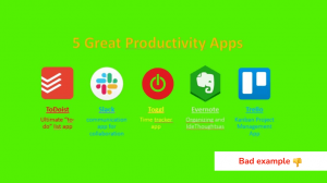
But the right color combination evokes the right emotions that lead to enjoyment of the PowerPoint presentation. For example:
- Blue shows trust, peace, and confidence.
- Yellow portrays optimism and happiness.
- Red shows passion and grabs attention.
- Green is associated with nature and the environment.
When selecting a ppt template with the right colors, consider the following:
- Audience.
- Your brand or that of the company you are representing.
- Niche or industry.
So if you need to improve PowerPoint presentation redesign quickly, use colors that are easy on the eyes and look harmoniously together. Use ppt templates with complementary color schemes when you want to draw attention to a specific point or data.
Stick to using basic coloring
Color themes are a powerful thing that can easily improve PowerPoint presentation. You can use colors to emphasize specific information or draw attention to a specific element in a slide. Yes, if you are a pro, you can use more than two colors in a slide, especially when giving an informative PowerPoint presentation. However, if you are giving a formal presentation to adults, stick to basic coloring.
Young kids will enjoy bold and vibrant colors in a presentation. However, when dealing with adults, consider using neutral hues. Besides considering your target audience, what else should you do when it comes to colors?
- Use color to create contrast.
- Use colors to make information pop and direct the train of thought.
- Take advantage of complementary and monochromatic color schemes.
- Brighter or vibrant colors balance dark backgrounds.
Don’t use more colors than needed in one slide, as it affects balance and creates confusion. On the other hand, the right colors improve PowerPoint presentation and deliver excellent results.
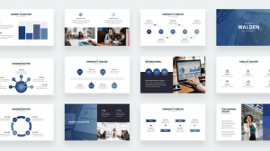

Contrast in a presentation is essential
One of the most effective ways to improve PowerPoint presentation is through contrast. It draws the eye towards something specific. Colors help to show contrast in slides and draw the viewer to something specific.
But when choosing to use different colors as a way to create contrast, remember that some of your viewers might have color blindness issues. While there are different types of contrast, including shape, shade, color, and size, here are the top tips for creating contrast:
- Black and white provide the strongest contrasts.
- The colors in the background and foreground should be different.
- The colors in the slides should be 30% lighter than what you see on your laptop.
The display for your slide, whether a laptop or projector, and even the room you will be giving the presentation might alter the color and brightness. So check the colors in dark and light to see the contrast difference.
In PPT, images are more powerful than words
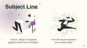
Our brains process images faster than text. That’s why visuals or images will be a good option for when you need to improve PowerPoint presentation. Besides, it’s easy to get overwhelmed by text in a ppt redesign.
On the other hand, images add visual appeal to the ppt slides, improve concertation and engagement. Having fewer texts and more images in slides also applies to academics and scientific ppt presentations.
But how many images are too many in ppt? Pros tend to combine beautiful images with text. However, it’s better to have more relevant images than text to redesign the ppt and make the content engaging. We are not just talking about pictures but also infographics, animations, and GIFs added to ppt.
Incorporating images in ppt slides has the following advantages:
- Saves time by preparing the ppt slides.
- Reduces boredom or dullness associated with class PowerPoint presentations.
- Helps to make complex concepts presented in a ppt redesign easy to comprehend.
Overall, the best PowerPoint slides makeover is rich in memorable imagery.
Use high-resolution clip art for your PPT redesign
Adding clip art is one of the things that can spice up a PowerPoint presentation. Instead of having ppt slide after slide, clip art breaks the monotony of the text and adds a striking visual effect to the PowerPoint redesign presentation. It also allows the presenter to showcase additional information not included in the PowerPoint slides. The advantages of adding clip art to a ppt redesign include:
- Helps get rid of using too many words.
- Keeps the audience’s attention.
- Improves the information in the ppt redesign and makes it memorable and engaging.
While, in some cases, outdated clip art makes your redesign presentation look unprofessional, it’s a great PowerPoint slide makeover if only it’s of high quality and can be scaled without distortion. So support your ppt redesign text with clip art as it assists the audience in visualizing the words.
Add meaningful visuals and interactions
Want a PowerPoint slides makeover to ensure your presentation makes a lasting impression? Add meaningful visuals and interactions. Most times, what differentiates a great PowerPoint presentation from a bad one is the content and visuals.
High-quality, relevant images make a presentation more visual. The trick is not to get carried away with the number of visuals included in a single slide. Instead of subjecting your audience to one boring slide after another, make a PowerPoint redesign and create an interactive presentation. How?
Tailor the presentation redesign to suit a wide range of audiences without having to edit the slides beforehand. When it comes to visuals and interactions in a redesign, stick to these three principles:
- Less is more.
- Consistently use high-resolution and quality images.
- Treat each slide as a special visual object.
Not all visuals will fit your message or the redesign you want. So choose correctly and avoid those with too many focal items, color, and contrast.
Align elements properly
Icons, shapes, and images are the most common elements in a PowerPoint presentation. Keeping these crucial elements properly aligned showcases professionalism in ppt and helps to grab the audience’s attention. It also keeps the ppt slides organized and makes it easier to convey the main message effectively.
Here are some tips to help you align elements like a PowerPoint redesign expert:
- Always select the object you want to align.
- Use ppt redesign guides are a reference to align objects correctly.
- For ppt redesign, have the option to align two or more objects.
- In a ppt redesign, you can align left, right, center, top, or bottom.
When you choose a specific position, for instance, to align the center if it’s two or more objects, they will be aligned vertically but centered on the ppt slides. For users who want a ppt redesign, aligning the text is another way to go. This involves tweaking the text placed inside the ppt text box.
Include a good background picture to improve your slides
Are your slides lacking a unique look? The simplest step to improve a ppt redesign is to include a background picture that will improve your PowerPoint presentation and clarify the message. A good background photo will personalize your PowerPoint presentation redesign and take it to the next level.

Here are five tips to help improve and select a great background image for a redesign:
- Go for a photo with a high resolution.
- Avoid choosing small photos as they will be distorted if the slide size is bigger.
- Ensure the picture makes it easier to see the text in the slides.
If the background image obscures the text, improve PowerPoint presentation redesign by adjusting the transparency or fine-tuning the text percentage. If you want to use that same background image in all the slides, don’t forget to select the “apply all” option when redesigning.
Incorporate interactive mockups
Don’t be fooled into believing that screenshots and diagrams can improve PowerPoint presentation. They add too much information to a slide and, in turn, make the presentation boring and visually unappealing. A quick way to improve a PowerPoint redesign is to use interactive mockups.
Even if you don’t have exceptional design skills, a mockup is a great way of ensuring your presentation makes a lasting impression. 3D mockups are also unique and a great tool for conveying your message. In case you feel stuck and require a unique way to make better PowerPoints, consider these tips:
- Use screenshots to create unique mockups.
- Copy the screenshots on a blank ppt slide.
- Edit and crop the image to hide unnecessary elements.
- Ensure the changes made on your mockups are duplicated in all the slides.
It’s optional to use PowerPoint hyperlinks to create interactive mockups. However, always test the mockup on different platforms such as laptops and mobile phones to ensure the font size is not affected regardless of the medium used.
Add relevant images to the redesign
Creating a redesign with engaging presentation slides that summarize the key points and capture attention is not easy. That’s why most professional presenters add pictures to improve PowerPoint presentation slides. But in a formal setting or when presenting complex or scientific information, most people don’t add photos to improve the redesign. However, that’s a mistake because it reduces the overall success of your redesign and PowerPoint presentation.
Before you add a specific visual aid to the redesign, consider its purpose. For example, apart from assisting in ppt redesign, use visual aids to:
- Summarize information.
- Reduce the total words to be included in redesign slides.
- Improve and enforce the points being talked about in the redesign.
- Make a stronger impact.
- Engage your audience and capture their attention.
While there are many benefits of using pictures in a ppt redesign, avoid cluttering them as it will make your work look unprofessional. So if you are asking yourself, “which is the ideal way to improve my presentation slides?” use these redesign tips:
- Use images consistently in all ppt redesign slides.
- Go for pictures that tell a story and improve the ppt slides.
- Incorporate photos that improve understanding of the ppt slides.
- Prioritize clarity and simplicity in your ppt redesign.

Adjust and format images appropriately in a redesign
PowerPoint has numerous effective features that can help correct a picture. That means you can play around with color, resizing, saturation, and even apply artist effects. This is a great option for anyone looking for “quick ways to fix my PowerPoint presentation.” What’s to love about PowerPoint redesign is that it ensures no non-destructive editing for adjusting photos.
If you realize that you have made a mistake in your PowerPoint presentation redesign, you can quickly reset, remove any changes, and get your original image. The editing and redesign option allows you to format your photo to ensure it holds the audience’s attention. Some of the tips that you can use to make your photo better and redesign your slides include:
- Sharpen the image to refine edges and correct slightly blurry images in the presentation redesign.
- Use brightness and contrast to improve the pictures and the redesign.
- Scale an image to fit your redesign slides.
Crop any parts of the images that you don’t want to appear on the redesign slides.
Use graphs to increase understanding of content
Graphs come in handy when ppt data is too large or complicated to be represented in the text. Graphs are a great tool when you need to “fix my PowerPoint presentation” or redesign the project because they can help showcase trends or similarities between two variables. The benefits of incorporating graphs in a PowerPoint presentation include:
- Improve comprehension of data added in the ppt redesign.
- Improve the visual interpretation of any complex numerical to be included in a ppt redesign.
- Highlight and improve the interpretation of salient features of the ppt data.
- Showcase relationships that may not be that obvious when viewing the ppt redesign.
- Improve comparison of a different set of data.
While a specific presentation may call for different types of graphs, all of them work to enhance PowerPoint presentation. Graphs improve focus and allow the audience to concentrate on one salient point. That’s why a presenter should create graphs with one clear message that is simple to understand and find meaning in presented data. Graphs also allow a user to back up their claims.
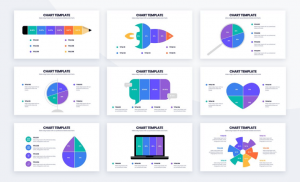
Modify graphs to suit the data in the presentation
Did you know that one great way to improve PowerPoint presentation is by enhancing the appearance of a chart? To improve it, override the default graph format and edit. However, if not used correctly, graphs can be distracting. So to improve a redesign, keep each graph simple and easy to comprehend.
That way, the audience won’t get confused or spend much time deciphering what the graph from your redesign means. For large data, convert it to graphs but follow these redesign tips to ensure you improve the slides’ visual aid:
- To improve a redesign, you have to choose a specific graph presentation that tells a story.
- The elements included in the graphs should not be distracting but improve the redesign and PowerPoint presentation.
- To improve a redesign, use colors to highlight the key message.
- To improve a redesign, use different colored lines to improve and contrast two items or variables.
Another trick to improve a ppt redesign is adding titles to your graphs with information you want the audience to remember. Then, for a simple PowerPoint slides makeover, apply the simple formatting commands that adjust the font size, color, and style.
Add bulleted lists to organize ideas
Writing, whether in an academic or professional setting, must be clear, concise, and organized. Bullet points can help to organize ideas. For example, to use them to “redesign my presentation and improve it,” list out key points or items from the PowerPoint presentation.
This is mostly because even in a PowerPoint presentation, the audience might scan your content instead of reading it line by line. A bulleted list will break up long blocks of text, improve it, and motivate your audience to read the information.
But for bullet points to be effective in a ppt redesign, you should do the following:
- To improve the ppt redesign, keep bullets short in order to motivate the reader to move through the presentation.
- To improve the ppt redesign, the bullets must be brief and act as mini headlines.
- Bullets should be formatted the same way as the text in the PowerPoint presentation.
Since bullet points should be thematically related to the text, you might wonder how they can help redesign or improve PowerPoint presentation. A bulleted list in a ppt redesign breaks up long blocks of texts into digestible chunks and keeps the audience reading down the slides.

Make the slides pop with the 2/4/8 rule
One of the quickest ways to enhance PowerPoint presentations or give a PowerPoint redesign a fresh look is to use the 2/4/8 rule. To improve your redesign, you should not spend more than 2 minutes on a slide. Moreover, a single slide should not have more than four bullets. Finally, a bullet point should not have more than eight words.
This powerful rule is popular among professional presenters. So to help you out, here are some pointers for the 2/4/8 rule that can help improve a redesign:
- Ensure that 2 minutes are enough to inform the audience about the key points.
- The four bullet points should highlight the main points.
- Adding only eight words per line to every slide ensures the audience doesn’t get bored.
The 2/4/8 rule works to ensure that your slides are not cluttered. It also shows that there is no need to squeeze all the information into a single slide. Instead, it helps supplement the short words with a lengthy verbal presentation
Replace long bullet lists with pictures
Replace a long bulleted list with a high-quality image. Combining graphics and information to create infographics is another great way to achieve an impactful PowerPoint slide makeover.
Since the infographic accommodates varying font types, font sizes, color contrasts, and imagery, it eliminates monotony and adds visual appeal. So which is the correct way to add infographics to PowerPoint slides? Follow these tips:
- Use data visualization to turn lengthy data in slides into fascinating pictures.
- Opt for a ppt slides redesign to play with different shapes and diagrams.
- In your ppt redesign, include icons to improve the overall look.
- Use vector graphics that can be customizable per your preference to improve the ppt redesign.
While bullets in a ppt redesign were meant to break long blocks of text and make paragraphs easier to digest, sometimes they fail to create a fascinating visual aid. But when replaced with a picture or infographic, your message becomes memorable and works to enhance PowerPoint presentation.
Make use of PowerPoint redesign presentation examples
If you want to improve your PowerPoint presentation by always ending up with a blank page, find appealing and relatable redesign examples online. The redesign samples will act as guidelines and inspiration for your next project. With a redesign example to follow, you will know which colors to use and what to include to ensure your PowerPoint slides makeover is a success. The trick is to use online redesign examples from reputable sites. When looking at examples, follow these tips:
- Go for redesign examples that capture your attention and note which areas you focus more on.
- Use the redesign example to check how the slides have been customized and use that aspect to create your pieces.
- Use the redesign sample to determine whether the PowerPoint presentation is image-heavy or text-heavy or combines the two approaches.
It’s often best to combine text and images in equal proportion to help give PowerPoint presentation redesign in a conversational style.


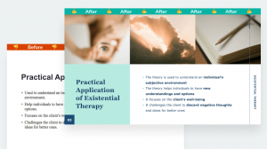
Improve the layout
Did you know that you can improve clarity with layouts? This is simple but important to help improve PowerPoint presentation. When the layout has too much content, including a chart, text, and picture, in a single redesign or slide, the audience often gets confused. That’s why when it comes to a perfect redesign, avoid complex layouts and stick to simple ones.
Not all PowerPoint slides will be equal. However, when it comes to ppt redesign, here are essential tips that result in a great layout:
- Always limit the number of items you add in a single slide layout.
- Ensure every text added to the layout is readable.
- Don’t overfill the entire layout.
- For a stunning redesign, leave white space between each element.
Use placeholders in the slide layout to set a good position for texts, images, graphs, and other visual elements. You can also create custom layouts and save them within the chosen ppt template.
Use shapes to redesign a winning PPT presentation
Are you fond of asking, “how do I redesign my presentation?” Shapes can enhance your PowerPoint presentation. Using other format options, PowerPoint shapes will elevate your slides and add a visual appeal to the content.
What’s even greater is that you don’t have to stick to using common shapes such as rectangles, circles, and ovals. Instead, opt for sleek shapes that transform your ppt presentation.
Shapes can help you create simple or even complex ppt illustrations that will showcase your professionalism. But what’s so great about shapes, and what are their benefits in PowerPoint redesign?
- PPT shapes can be resized without getting distorted or losing image quality.
- PPT shapes offer immense flexibility.
- PPT shapes come in a variety of sizes, from large to small.
- PPT shapes are great for creating flowcharts, illustrations, and other basic diagrams.
Use the rule of thirds to improve PowerPoint slides
Anyone looking for a quick way to improve PowerPoint presentation should use the rule of thirds. It offers an easy way to make attractive slides that capture attention. The rule of thirds is based on the principle of dividing the slides into nine equal parts with two horizontal and vertical intersections.
Based on the rule, you should keep important visual elements in your redesign within the intersections. To use the principle effectively to redesign slides, follow these tips:
- Use the guide feature in PowerPoint to draw four lines on the slides and improve your redesign.
- Both the vertical and horizontal lines should divide your images into thirds and make the redesign better.
- In the redesign, ensure the lines intersect at four points, also known as the power points.
Note that even if your image has several elements, the viewer’s eye will be focused on the power points. Therefore, when you need to improve PowerPoint redesign and achieve maximum impact, place the key elements in the power points.
Add GIFs to your PowerPoint slides
Is your ppt presentation missing a wow factor that can appeal to a target audience? Are you asking yourself, “how do I fix my PowerPoint presentation and make it less boring? Insert a GIF into your ppt slides. A well-placed GIF makes the ppt presentation entertaining, which appeals to a younger audience. The ppt slides redesign can also add humor and capture attention.
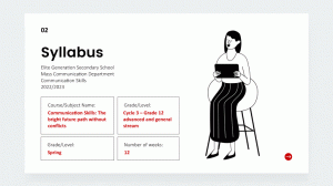
Most people might refrain from adding GIFs to PowerPoint presentations because they believe it requires special skills or tools. However, inserting a GIF into ppt slides is just like adding an image. The steps include:
- Download a GIF.
- Open PowerPoint slides.
- Insert a picture.
- Choose the location where you placed the downloaded GIF.
- Insert the GIF in a specific position in the ppt slides.
Depending on the device you are using or the version of PowerPoint, you may choose clip art or picture instead.
Make slides advance automatically
PowerPoint allows users to improve their presentation with special effects. For example, you can create slides that advance automatically using the autoplay feature. This eliminates the need to keep clicking a slide whenever you want to move to the next one.
For a presentation, having an automatic advance feature shows professionalism and that you are well prepared. On the other hand, clicking a slide during a PowerPoint presentation can be distracting and cause you to lose flow or rhythm.
If you want an effective PowerPoint slide makeover, consider creating a slide show that advances automatically. But before setting the advance option, consider the following:
- Have you practiced beforehand to ensure your slides advance with your speech?
- Do you want to focus on the audience instead of looking at the slides?
A self-advancing PowerPoint slide would fit your needs if you answered yes to any of these questions.
Use animations wisely
Animation can improve PowerPoint presentation. It’s also a go-to option for anyone who wants to make better PowerPoints. While adding animation to ppt slides is risky, especially if it’s distracting, it will often improve the presentation redesign.
The trick is to use animations that complement your ppt message. That way, the audience understands what the animation represents, eliminating misunderstandings. If you want to incorporate animations as a way to improve PowerPoint, consider these tips:
- Use animation as a tool to help your audience connect with the message in the ppt.
- Use eye-catching animations to break the monotony of the ppt text and capture attention.
- For long ppt presentations, use animations to engage the audience and prevent fatigue.
- Use animations to draw attention to key points or new terms in the ppt.
While animations are great for presentations, they can only be effective if kept simple. So avoid using several animations in a single slide and use them consistently.
In PPT, it’s better to keep transition effects at a minimum
Animation and slide transition effects have a poor reputation among many professional PowerPoint presenters because they can distract the audience. However, simple animations and quick slide transitions can add meaning and improve PowerPoint presentation or redesign. But before you include a transition and animation into your slide as a way to “improve my presentation redesign,” consider the following:
- Context and relevancy.
- Whether the ppt redesign presentation involves complex or simple data.
- Which points need more attention and can help improve the ppt redesign.
If you fail to use transition effects or animations, your PowerPoint presentation can appear boring. Adding only one or two animation effects is a great PowerPoint slide makeover. This ensures that the effects of the redesign don’t overpower the message.
PPT slide transitions also add professional impact and draw attention to important data. When appropriately customized, you can use the effects to control the speed at which the PowerPoint slides appear on the screen.
Change slide size to fit your presentation
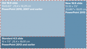
PowerPoint usually has two common slide sizes: 16:9 and 4:3. The first size is ideal for ppt presentations that involve a modern projector. However, 4:3 is great when you are using an old model device. But what if I want to redesign my presentation? Are these the only slide sizes appropriate for ppt? Of course, not.
You can customize the slides to fit the size you want. This is often an option if 4:3 and 16:9 are unsuitable for the ppt redesign. But before you customize the size of your slides, here are some tips to consider:
- 4:3 is great for creating multipurpose ppt content to be printed or shown across different platforms.
- 16:9 is great for high visual ppt content.
- Use 4:3 when the ppt slides are not going to be projected on the LCD screen.
It would be best if you also educated yourself on the ppt aspect ratio. For instance, the 4:3 aspect ratio is 1024×768 pixels, ideal for smaller ppt slides and screens.
When in doubt, dump the slides
Thanks to PowerPoint, it’s possible to have a ppt redesign that creates engaging content. However, sometimes even after looking at several examples, you can find out that your presentation is still dull. For example, if you have tried several times to improve PowerPoint presentation, but the result is slides that will bore the audience, then dump the whole project and start over.
The main aim of a PowerPoint presentation is to hook the audience on the message you are conveying and make them understand it. That is, if your ppt redesign does not have the necessary elements to hook the audience from the word go, it’s best to trash it. To make your next PowerPoint redesign a success, adhere to these tips:
- Replace large chunks of texts in ppt with stunning visual elements.
- Use animations, clip art, and GIFs sparingly in ppt.
- Instead of adding text in ppt, think like an editor and delete what can be omitted.
Finally, be consistent with font size, color schemes, font types, and bullets used in any ppt redesign.
Now that you know how to create a perfectly-balanced presentation, let’s find out how to present it to your audience in the best possible way. These tips will be especially relevant for teachers, lecturers, and presenters.
Present PPT material in short phrases
Presenting the material in short phrases rather than full sentences is another way to improve PowerPoint redesign. It ensures you don’t focus more on reading from ppt slides as it’s an ineffective way to teach. Instead, adding only a few short phrases to improve PowerPoint presentation allows you to focus on one idea and make the topic easier for the audience to understand.
The benefits of shorter phrases in a PowerPoint presentation redesign are as follows:
- It leaves less room for your audience to focus more on what is written on the ppt slides.
- It allows your audience to focus on your thoughts, explanation, and insights on the subject discussed in the ppt redesign.
- It lets the audience know and focus on the main point presented in the ppt redesign.
To improve PowerPoint presentation at any time, stick to short phrases that do not exceed 30 words or one line. Emphasize the short phrases with bold or bigger font sizes.
Include verbal explanations for pictures/graphs
It’s without a doubt that visual aids improve PowerPoint presentation redesign. PPT slides increase an audience’s understanding of the topic. That’s why pictures and graphs are great for anyone asking themselves, “how do I fix my PowerPoint presentation redesign.”
But without a verbal explanation, it can be challenging to comprehend the information in the ppt redesign presentation. So to give PowerPoint slides makeover, accompany visual aids with verbal explanations. Adding verbal explanations in ppt redesign slides is important because:
- A real-time ppt presentation allows the audience to ask questions about the visual aids used in the redesign.
- It enables your audience to assimilate the content better and freely discuss any doubts.
- It allows the lecturer or presenter to give real-time answers to any relevant question asked.
Simplicity in the verbal explanation is key in assimilating the message and a great way to improve a redesign or a PowerPoint presentation.
Don’t make the audience read the information on the slides
It’s hard for people to concentrate on what you are saying and still read the content on the slides. So if you want to make better PowerPoint presentation, don’t make your audience read the slides. Instead, allow them to listen to you and digest the information you have given in the redesign.
When the audience reads the slides, there is a high chance that they will not listen attentively. This reduces the concentration and retention of relevant information. It also beats the purpose of PowerPoint slide makeover. Besides, listening makes it easier for the audience to take notes and remember the key points in the redesign. When making a redesign, instead of allowing your audience to read the slides on their own, consider these four tips:
- At the beginning of the PowerPoint presentation, tell the audience what to expect.
- Elicit conversation to prevent the audience from focusing on the slides.
- Use the redesign to open with a story that ties to the topic to captivate your audience.
- Blackout the screen to ensure you are not competing with the PowerPoint redesign slides.
Fade to black when speaking
In search engines, the phrase “redesign my presentation” is commonly asked by presenters who want to be pros. However, one answer that is often overlooked but can easily improve PowerPoint presentation is the fade-to-black effect.
It’s often considered a transition that prevents the audience from concentrating too much on the slides. Instead, it allows the listeners to focus on the presenter. If fade-to-black is a new concept to you, check out the tips below:
- Use the fade-to-black effect to carry and improve your narrative.
- Fade-to-black provides room to pause and move on to the next slide.
- Use fade-to-black to get undivided attention and connect with the audience.
The chances are high that you have not been using the fade-to-black effect in your presentation. However, we recommend you try it because you are definitely missing out on a big opportunity that can enhance PowerPoint presentation.

Use PowerPoint slides to boost note-taking skills
One efficient way to make better PowerPoint presentation slides is to ensure your lectures improve note-taking skills. How?
With PowerPoint slides that summarize the subject or topic under discussion, students will have all it takes to improve and make good notes. In addition, learners will be able to follow what the lecturer is saying to understand key points given in the ppt slides.
The key to improving note-taking skills is to do it when the professor is not talking, decreasing information retention and learning. If a professor realizes that students focus more on taking notes than listening, they might have to do a PowerPoint redesign. For starters, ensure the ppt slides don’t have too much text that takes too much time for students to write down. When presenting your ppt slides, promote active listening by:
- Repeating the main points stated in the ppt slides.
- Asking questions to help learners focus on what is being said in the ppt slides.
- Don’t cover what is not included in the ppt slides.
- Don’t speak too fast or often point at the ppt slides.
And last but not least, take breaks or pauses between ppt slides to allow students to catch up and not miss any crucial information.
Give PowerPoint slides before the lecture
Do you sometimes see a specific student struggle to understand your ppt presentation? The solution might lie in the PowerPoint slide makeover. Most professors are used to presenting the slides during the actual lecture. This is because some students will not attend class if given the ppt slides before the lesson. However, there are numerous advantages to making the ppt slides available before the lecture.
- The ppt slides act as a guide for note-taking.
- When you improve a ppt redesign, it allows your audience to add information that was verbally discussed during class.
- PPT redesign increases student participation and concentration.
PowerPoint slides given before class allow the audience to gauge which sections they might find difficult to comprehend and ask relevant questions. However, if your students don’t attend class after getting the slides and you ask yourself, “how do I fix my PowerPoint presentation?” we recommend considering the quality of the slides. Ensure the slides don’t divulge every important detail. That way, you leave room for a verbal presentation to fill in the blanks and explain the subject matter further.
Use PowerPoint slides structure to complement lectures
Every teacher has used PowerPoint slides to improve lectures. But some of the teachers end up creating the slides in a dull way that makes students bored. However, the appropriate use of PowerPoint slides can be a great teaching tool as long as it follows a logically sound structure. This is another great tip to improve PowerPoint presentation redesign.
So how do you structure slides and improve PowerPoint presentations?
- As a way to improve the ppt slides, include the outline view to help you get a quick overview of the content
- Ensure slides from the ppt redesign include the table of contents to ease navigation
- Combine ppt slides into collapsible and expandable sections
The trick to improve PowerPoint slides is to make the presentation just like any other narration. Ensure the ppt redesign has an introduction, body, and conclusion. Besides, you can also give the PowerPoint presentation slides to students before class to enhance understanding and memory.
Wrapping up
PowerPoint presentations can be a great tool to get information across, demonstrate your expertise, projects, and accomplishments, as well as supplement a lecture. However, slides have to be created using best practices to get you the result you want.
Observance of a few simple principles will help you easily make effective PowerPoint presentations in 2022:
- Design your PowerPoint slides in one style. Use font, color, and shapes to create a visual hierarchy.
- Arrange elements so that everyone can immediately read the most important message.
- Highlight key elements with color, shape, or layout. Create a contrast or color spot.
- In the text, try to highlight the most critical phrases. This can be done using the color, thickness, or size of the text.
- Choose flat icons and simple shapes instead of 3D elements and rendered details.
- Use the built-in alignment tools (ruler, guides, and grid in PowerPoint).
- Copy slides and elements instead of re-creating them. An excellent PowerPoint presentation design is the reproduction of items, colors, and other objects.
In case you’re not good at slide design, don’t worry. SlidePeak can help you ensure each slide of your PowerPoint presentation looks professional and grabs your audience’s attention from the first line.


