If you want to explain medical concepts or demonstrate a new medical invention, you’d better use medical presentations in PowerPoint. It allows you to make your slides modern & visually appealing with a few creative design moves. Suppose you need to illustrate a healthcare document or make a presentation on a medical topic. In that case, PowerPoint is good for organizing all points to mention, supporting your speech with images, and attracting people with great animation.
You can find plenty of medical presentation examples on the web to inspire or borrow some elements, e.g., icons, colors, themes, etc. If you lack time and skills, you can always address professional services and order medical or business presentation slides. It helps to devote more time to speech and full sleep.
Today, let us help you find out when to use, how to start, and what to add to create modern-looking healthcare PowerPoint visuals.

When to Use Medical PPT Presentation?
Initially, presentations are used to inform, educate or persuade different external and internal audiences. Medicine includes hard and simple explanations, so you can create a healthcare presentation for both children and scientists.
Using the power of words and correct animation, you can deliver the most complex concepts and explain to pupils how blood cells move. So, medical slide presentations are used for:
- Medical conferences;
- Medical cases;
- Medical training;
- Medical networking;
- Medical investment pitch;
- Medical services presentation;
- Medical TED talk;
- Medical university/college/school lecture;
- Medical invention demonstration.
We bet you can make up more situations where medical presentations fit, and we’ve collected the most common causes. Anytime you talk about healthcare problems or news, you need a medical presentation.
How to Start a Presentation on Healthcare?
Medicine topics refer to the section of hard ones, so PowerPoint presentations must be used wisely and correctly to make speech easier to understand. If you have to explain complex concepts, the presentation can be your life-saver if you approach it in a meaningful way.
Step 1: Rely on visuals
The first step is to look for visuals that can accompany your text. PowerPoint was created for animation, but many people incorrectly use slides for paragraphs of scientific information. Meanwhile, we grasp visual information 60,000 times faster than written one.
So, whenever you present technical information, your audience would want relevant visuals to support their understanding. Do not name types of bone fractures or blood cells, show them!
Step 2: Crop and enlarge your images
The next step is the extension of the first one. We recommend using one picture per slide and enlarging it if it contains tiny elements. For example, you want to show a cataract, so increase the image in size for all people to see clearly. Do not be afraid to sacrifice text for the big high-quality picture.
Step 3: Use charts to visualize numbers
Please, forget about bullet points and endless lists on slides. Pity your audience.
- Decide how many numbers or statistics you have to add as separate slides.
- Do not mix pictures with charts or graphs.
- Make them simple but clear.
- Use contrasting backgrounds and comment on every figure.
See, bullet points are only good in articles to make some space and differentiation in a long text.
Step 4: Make your graphics look more professional
Google for medical presentation video tutorials or address custom presentation services to improve PowerPoint presentation. If you need to present in front of professionals, they will most likely have expectations. Thus, use high-resolution images, position every element accordingly, match sizes of arrows/lines within one slide, and just remove all alien elements that clog the animation.

8 Simple Tips to Improve Your Healthcare PowerPoint Presentation
Even though the following tips are simple and easy to implement, they will have a significant impact on your medical slides.
Think ‘Non-Linear’
If you have to explain some definitions, do not present them in a boring linear way. It can easily disengage the audience from the slide. Instead, create an animated explanation with arrows: make the main word big in the middle of the slide and ‘draw’ around it. Why use only words if you work with PowerPoint?
Use simple animated visuals to explain concepts
For example, you have to explain how molecules move in the electric field. A sheet of hard-to-understand text does not attract the audience at all. To engage people better, draw how charged molecules move forward and back. Besides, add an oral explanation for people to visualize better. Thus, the information sticks to the audience’s brains and keeps them involved till the presentation ends.

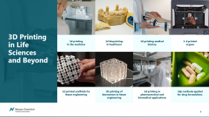
This slide does not just give a list of 3D printing examples but shows its real usage, which helps the audience visualize the information.
Label your images right
Images are an integral part of any medical presentation, but some presenters misuse them and create eye hops. It means the number of places the eyes have to land on a slide to gather information. When you create a presentation, THINK ABOUT THE AUDIENCE. Try to imagine how their eyes walk through the slide and make this path as convenient as possible.
For example, when you label throat parts, do not create a 1-5 list next to the picture. It may get people tired to walk from the list back to the image and again to the list. It is better to avoid numbers and label parts with names immediately.

Here is a great example of a visually attractive and informative slide. The author has exactly thought about the people because he helped them perceive the information step by step.
Use tables for comparison
Bullet points are good, but slide space is limited, so you’d better use it wisely. Even if you apply custom animation using bullet points, you still present in a linear way. Accordingly, we advise you to use the table to compare two items with a column that defines the characteristics you oppose. It helps the audience of different levels to follow your thoughts. If people do not understand, they distract faster. So, do not let them do it.
Pay attention to information clarity
Make sure the images you place on the slide match with headlines or other marks. Sometimes, people are afraid of many slides and try to put images and text into one. And they disregard the fact that the audience in the back seats sees nothing.

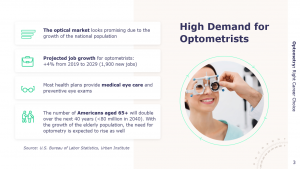
For example, this slide is good and informative, but the text might not be visible for the last lines.
Use charts to present numbers
For example, you want to list etiological factors for a specific disease. Instead of simply saying percentages, show them! People perceive and remember visual information better, so use charts to show the share of each factor. PowerPoint is created for animations, so always look for ways to avoid many words.
Lead with appropriate visuals
We highly do not recommend using photos of wounds, skin/organ diseases, or other body health problems. It may avert some people because these pictures aren’t indeed attractive. Instead, use drawn pictures, e.g., do not show SSI classification on real skin but use cross-section (like the one used in medicine books).
Avoid Using Photos as Slide Backgrounds
Strangely, many medical presenters still use photos for background for some unknown to us purposes. On the contrary, we suppose it is extremely hard for the audience to differentiate the main image or words from the background clog. Background photos do not bring you much value, but people perceive things better on a pure basis. So, please, stop using this habit. The simpler, the better!
Conclusion
Eye-catching animation has never spoiled anyone’s medical presentation. By adding suitable colors and pictures for a neat look, you demonstrate your expertise and support your speech. You will no more get lost if someone interrupts you. Complex topics are better explained with attractive visuals because all people perceive information better if accompanied by images. Therefore, you should use this preference to fit the audience of any size, age, and gender. Master medical presentations in PowerPoint and enjoy people’s attention!


